Fabric
Jill x Cogcentric Labs Inc
A collaborative project including software developers, designers, and a project manager to create a software interface and style guide, including colours, fonts, spacing, nav bar, layout elements, icons, buttons, etc. to be implemented in a web interface.
#UI design #interface #dashboard
Skills and Responsibilities
- Collaborate with software developers, designers, and project managers to create a software interface and style guide.
- Conceptualize, design, and prototype user interfaces for web-based applications.
- Create wireframes, high-fidelity mockups, and visual assets that adhere to the project's style guide.
- Design simple, web-friendly animations for a working prototype with an appealing, predictable, and intuitive look across the software interface.
- Ensure the design is user-centered and test it with real users to ensure usability and accessibility.
- Communicate design decisions and collaborate with team members to refine and iterate on design solutions.
- Stay up-to-date with design trends and best practices.
Deliverables
Interaction Design:
High-fidelity wireframe and mockups
Style Guide:
Interaction Design:
High-fidelity wireframe and mockups
Style Guide:
- icons
- Buttons
- Text fields
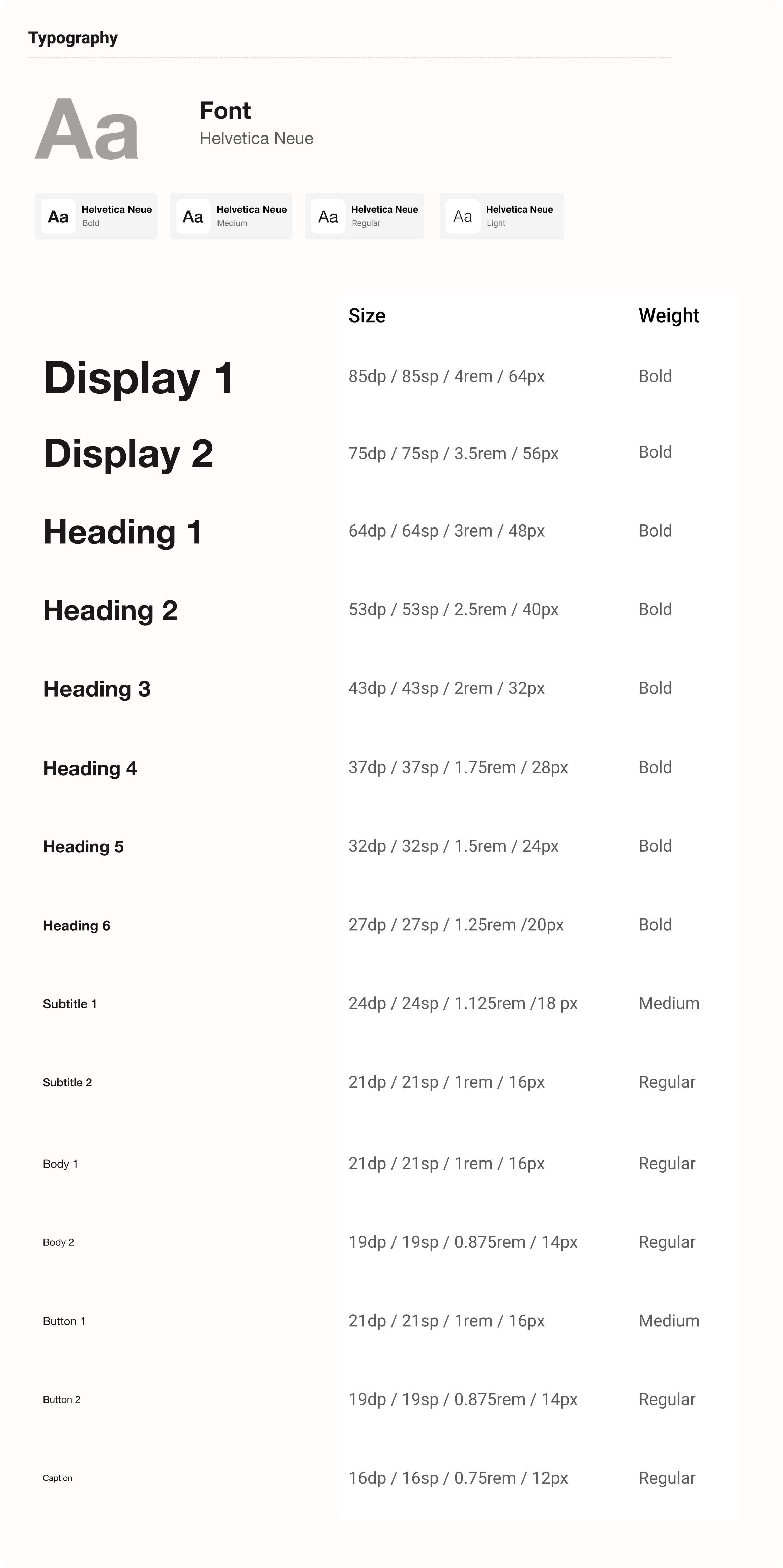
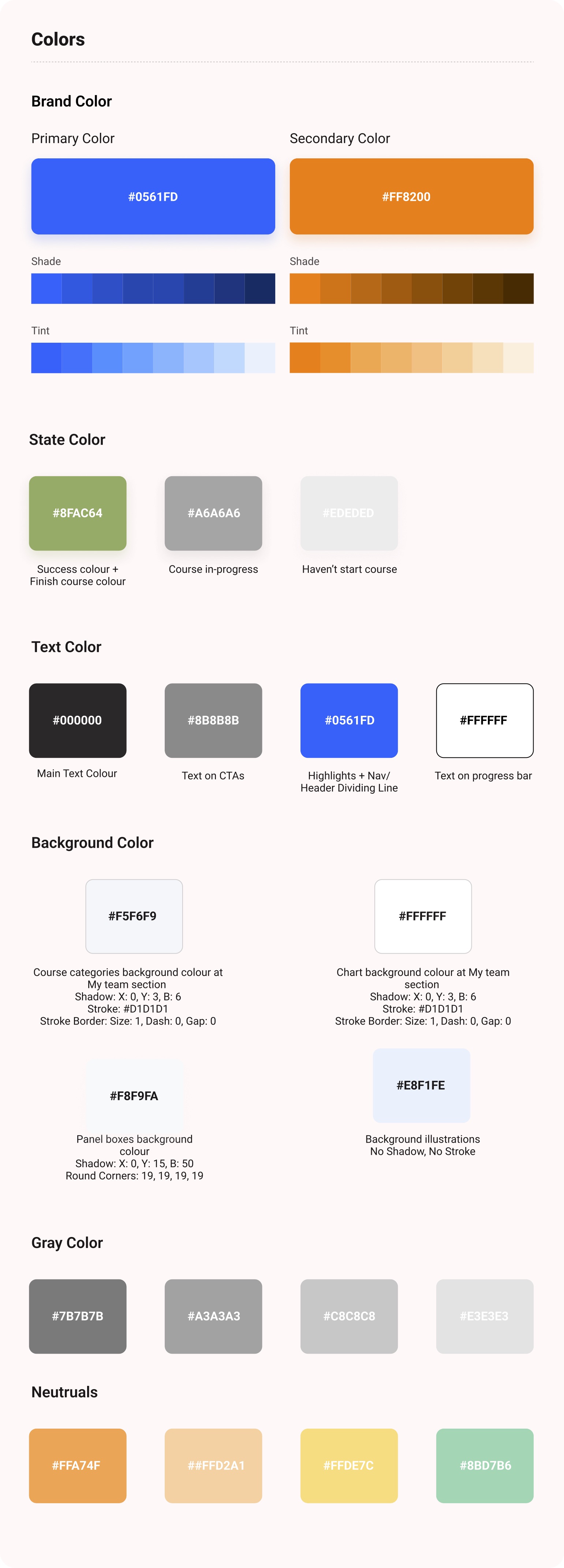
- Typography
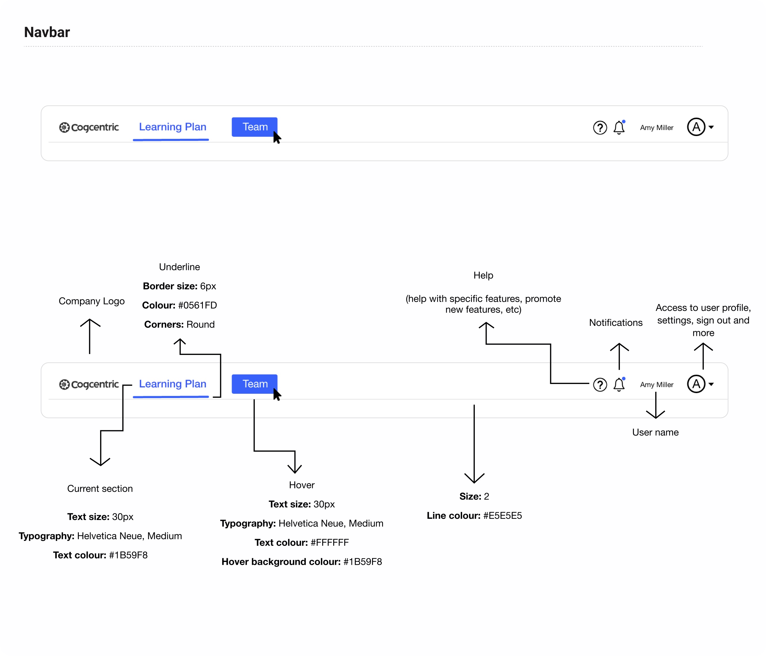
- Navbar
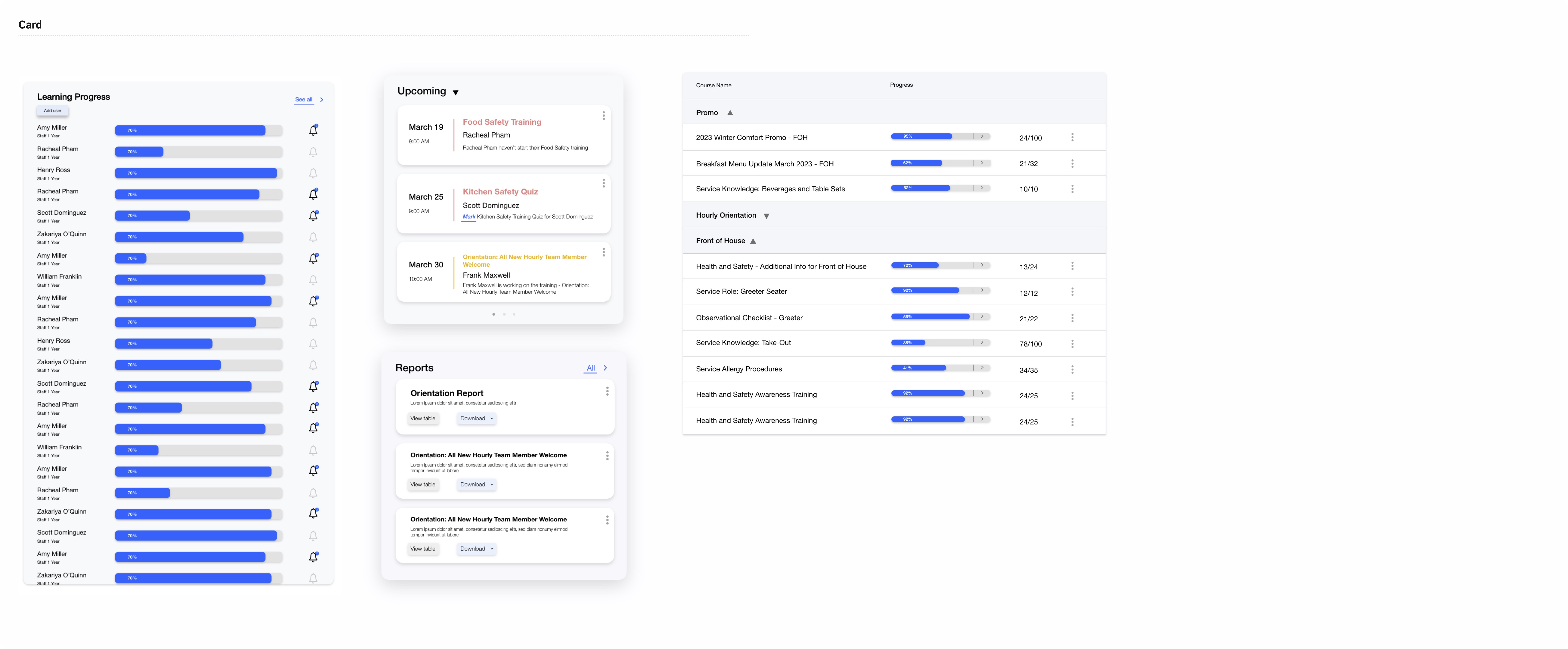
- Card
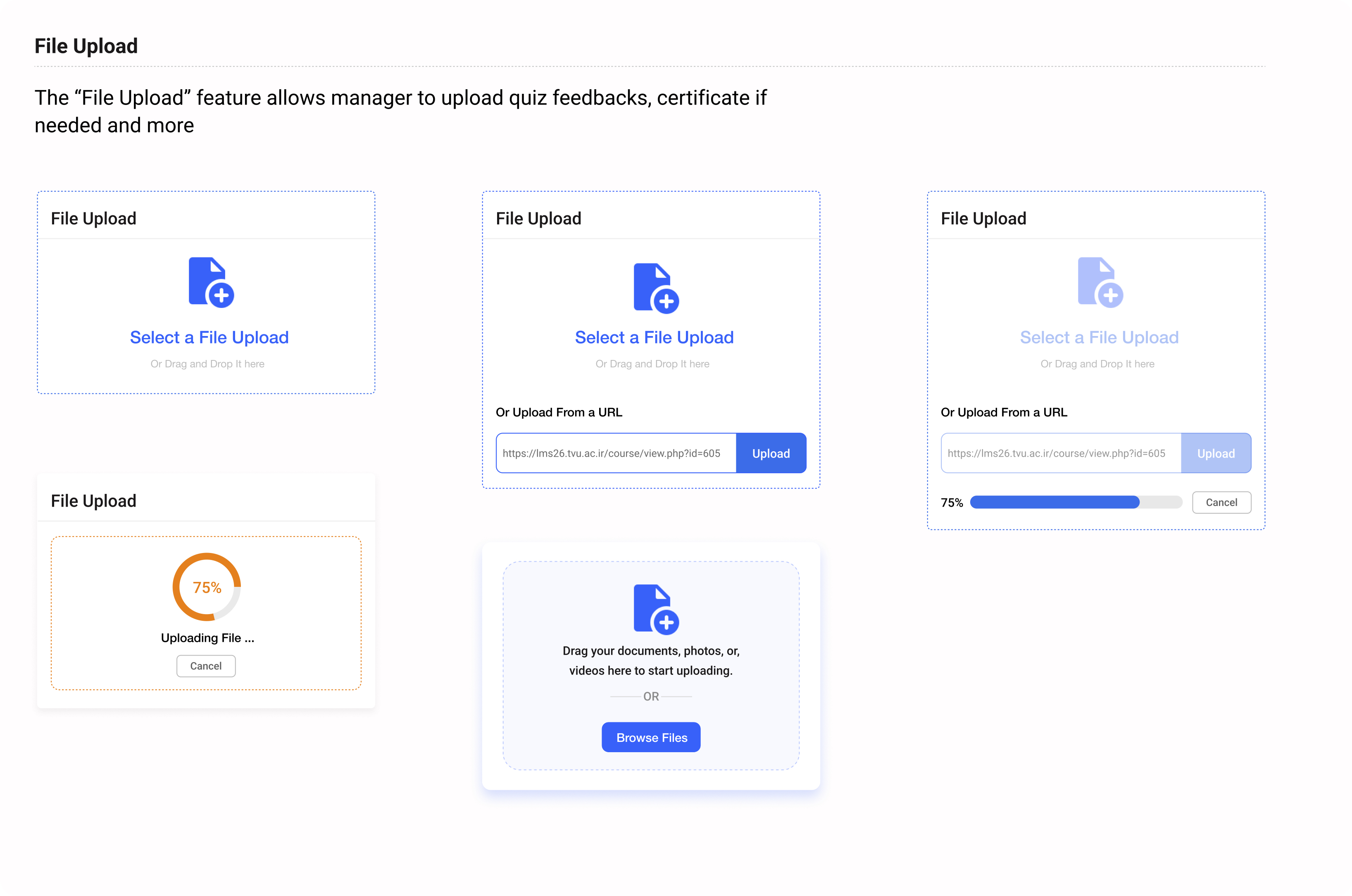
- File Upload
- Calender
- Dropdowns
- Checkbox, Radio button and Toggle
- Progress bar
- Spacing
Project Specifications
Duration: 4 months (2023)
Tools:
Duration: 4 months (2023)
Tools:
- Photoshop
- Adobe XD
- Figma

“An LMS, Learning Management System,
is a software tool that allows users to
create, share and monitor employee
training courses.”
Challenges
- Designing for scalability: With the possibility of having over 500 employees, it's important to consider how my design will scale to accommodate this growth without causing loading time issues.
- Customizability and uncertainty: Since the information is customizable from different companies and can vary widely depending on the scenario, it's crucial to create a design that is adaptable and can handle this uncertainty without sacrificing usability or clarity.
- Balancing complexity and simplicity: Striking the right balance between a design that is comprehensive enough to handle a large volume of information, while also being intuitive and user-friendly, is key to creating a successful solution.
Proposed Solutions
- Optimize loading time: To prevent slow loading times as the number of employees grows. I have chatted with the developers and other designers to see what we can do. Team has suggested that we could use techniques such as lazy loading, image compression, and caching to optimize the website's performance.
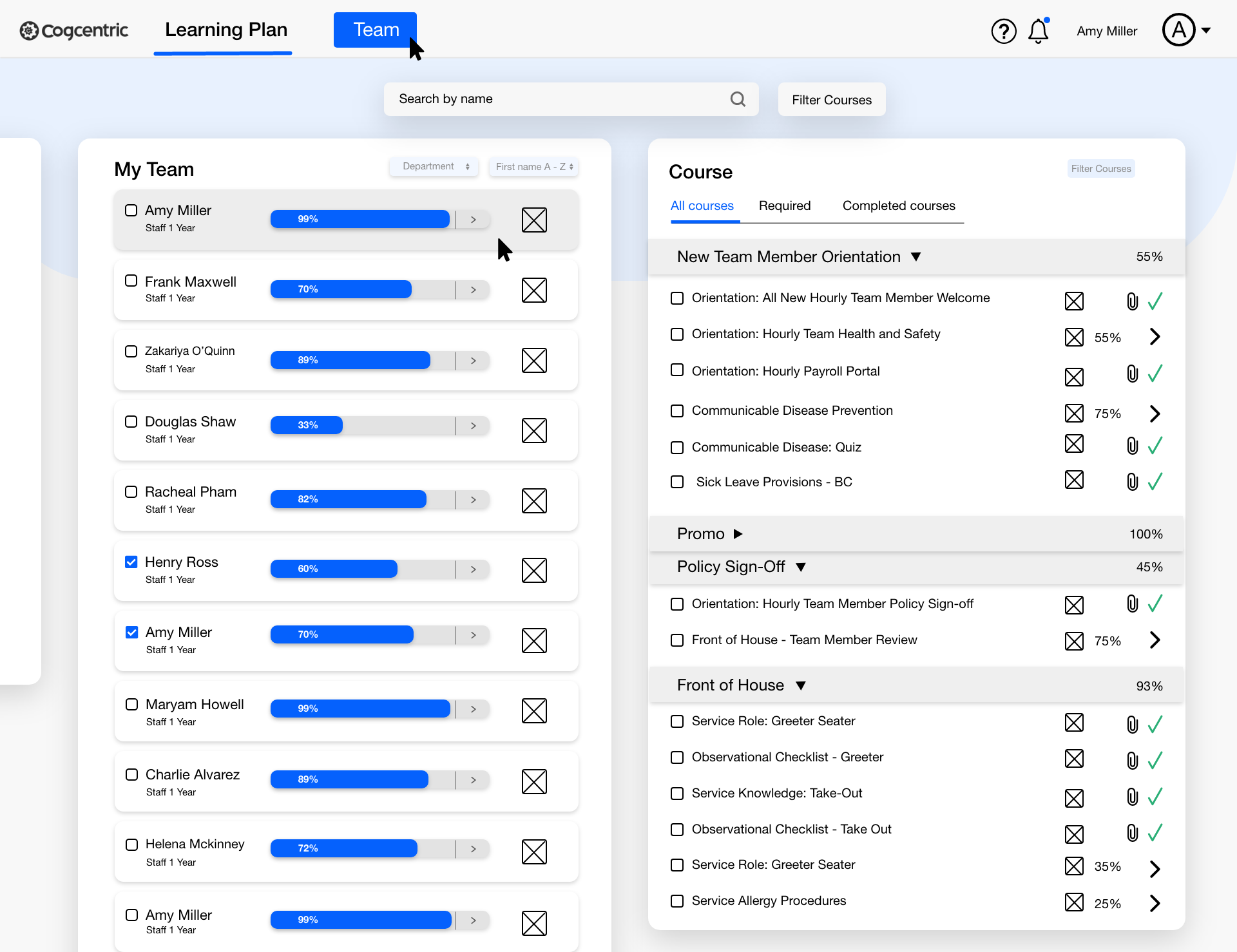
- Use modular design: A modular design approach can help us create a flexible and scalable design that can adapt to changing needs and situations. I have created the “box” system in my design - we break our information and data into small pieces and put them into these boxes which give users the flexibility to customize the page however they want.
- Use visual hierarchy and consistency: By using a consistent visual hierarchy and design language throughout the website, it can help users navigate and understand the content more easily, even if it varies in terms of customization. This could involve using consistent typography, color schemes, and layouts to create a cohesive and visually appealing design.
Design Process


︎ Getting Closer to User-Centered Design ︎
Visualizing a User-Centric Experience
Sketching wireframes is an essential step in the website design process. At this stage, wireframes are simple, bare-bones representations of a webpage's layout and functionality, without any design elements such as colors or graphics. Sketching wireframes also help me identify potential issues early on in the design process, such as navigation difficulties or cluttered layouts.


(first couple versions of the sketches)
Understanding What Users Find Intuitive, and Why
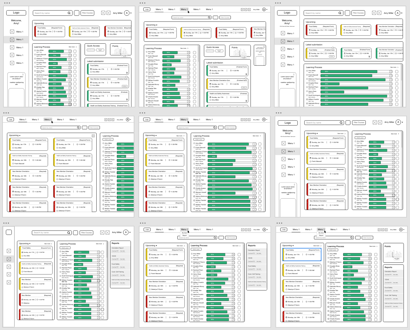
Wireframe
In UI (User Interface) design, wireframes are visual representations or blueprints that outline the basic layout and structure of a web page, mobile app screen, or any digital interface. Wireframes are typically low-fidelity and do not contain detailed design elements like colors, images, or typography. Instead, they focus on the fundamental elements and their arrangement on the screen.
Wireframing at this step has helped me...
- Layout Planning: Wireframes provide a visual framework for designing the layout of a web page or application screen. They outline the placement and arrangement of elements such as buttons, menus, text, and images.
- Content Hierarchy: Wireframes help establish the hierarchy of content by indicating which elements are more prominent and which are secondary. This ensures that users can easily discern and engage with the most important information.
- Early Feedback: Wireframes offer a low-fidelity representation of the UI, making it easier to gather feedback from stakeholders, clients, or users at an early stage of the design process. This helps identify potential issues and improvements before investing in high-fidelity design.
- Functionality Visualization: They illustrate how different interface elements will function and interact with each other. This includes depicting user interactions, navigation paths, and the flow of actions within the interface.
- Iterative Design: Wireframes support an iterative design approach. Designers can quickly make adjustments and refinements to the layout and functionality based on feedback, user testing, or changing project requirements.
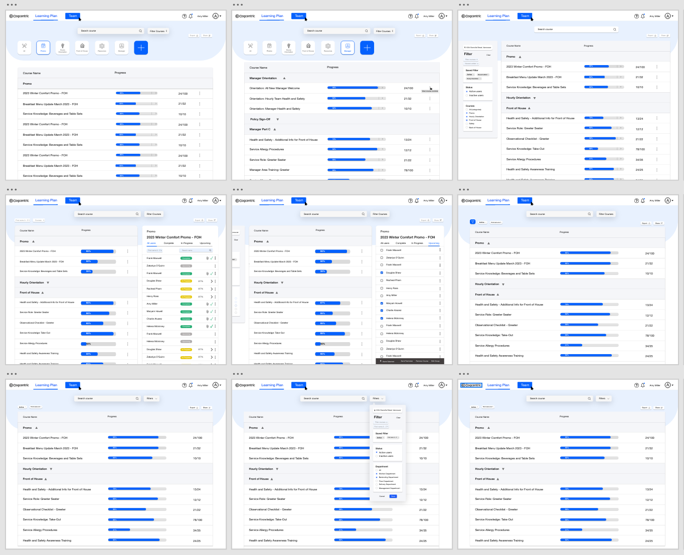
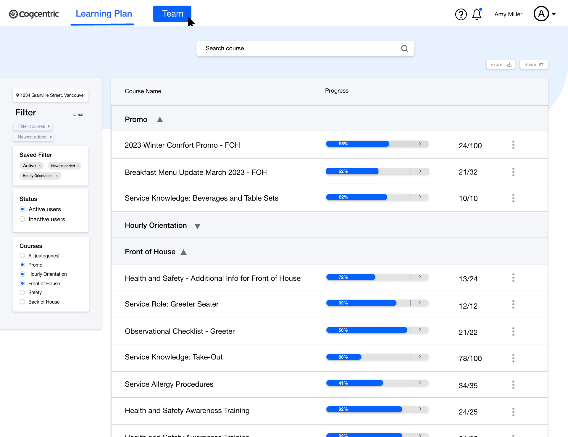
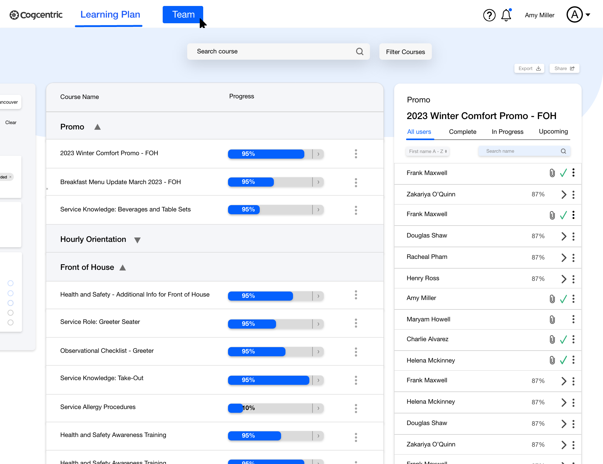
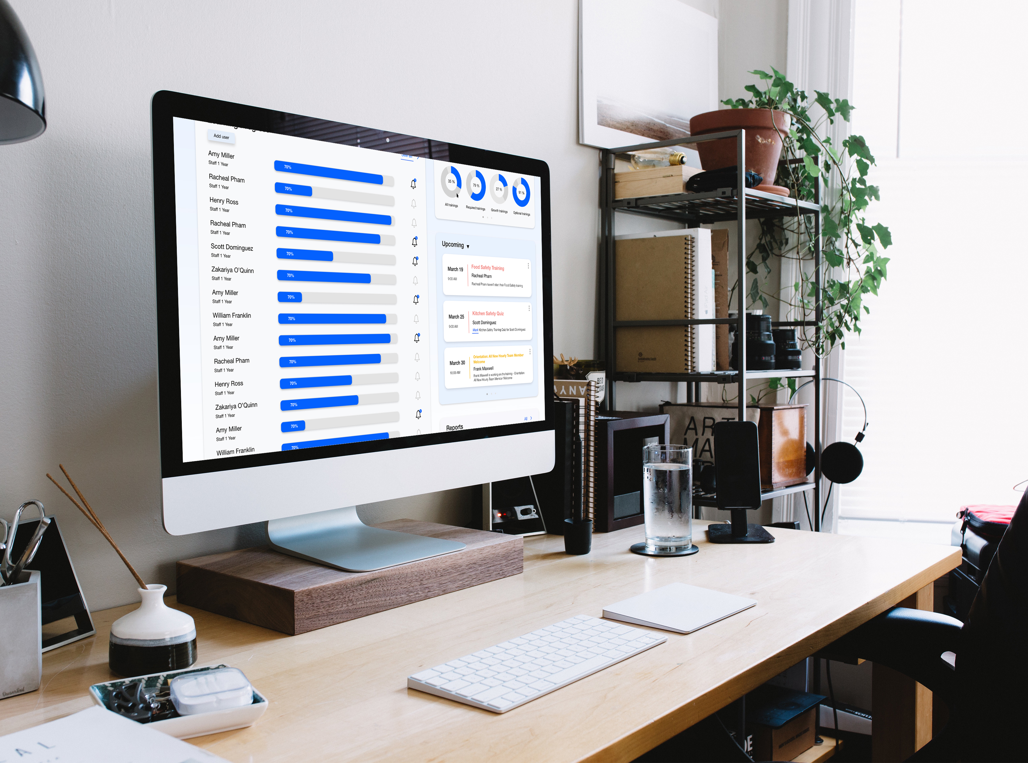
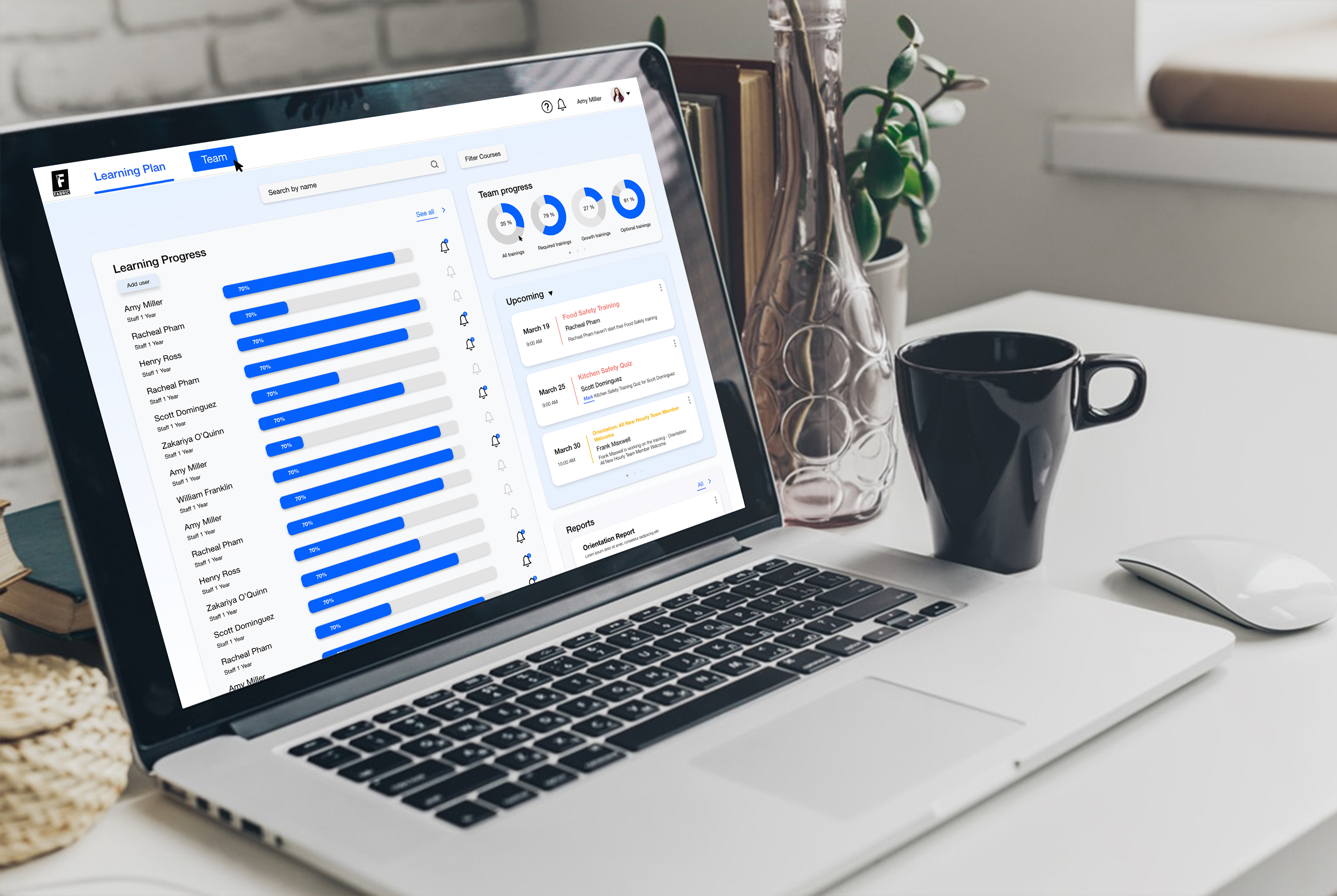
Visual design - Style Guide
It’s time to design the elements that would make this dashboard look better. This is where we have exploring colour, typefaces, and crafting a repository of visual elements consistent with the company's brand identity.


High fidelity designs
A high-fidelity wireframe in UI (User Interface) design is a detailed and polished representation of a user interface that closely resembles the final product in terms of visual design, layout, and functionality. While high-fidelity wireframes offer a highly detailed view of the UI, they are not the final product. They are an intermediate step in the design process, bridging the gap between conceptual design and actual development. Creating high-fidelity wireframes can be time-consuming, but they play a crucial role in refining and finalizing the user interface before implementation.
- Create pixel perfection
- Create visual design consistency
- Add a sense of your brand
- Select final design assets
- Get final approval from stakeholders
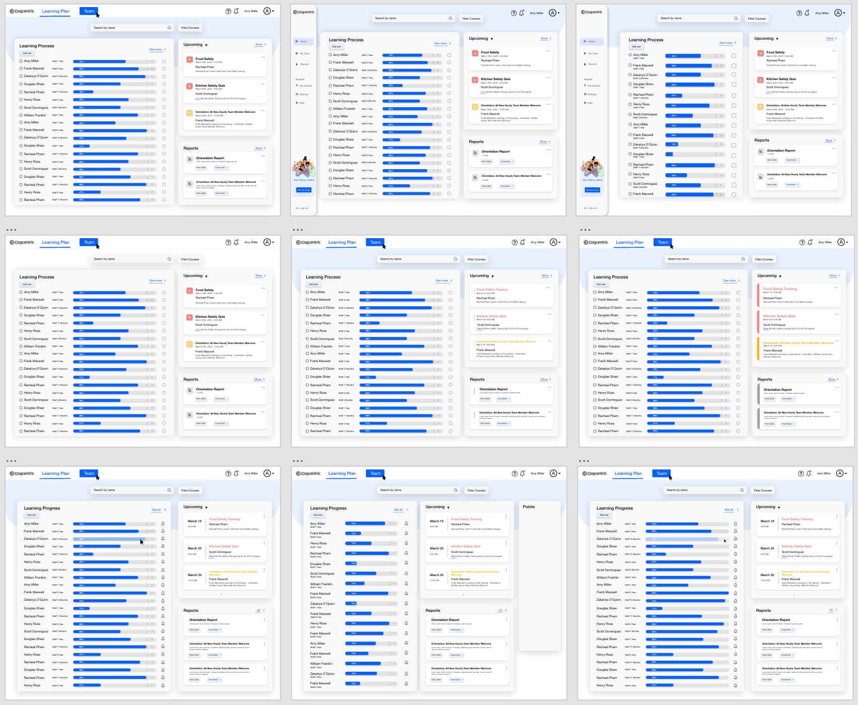
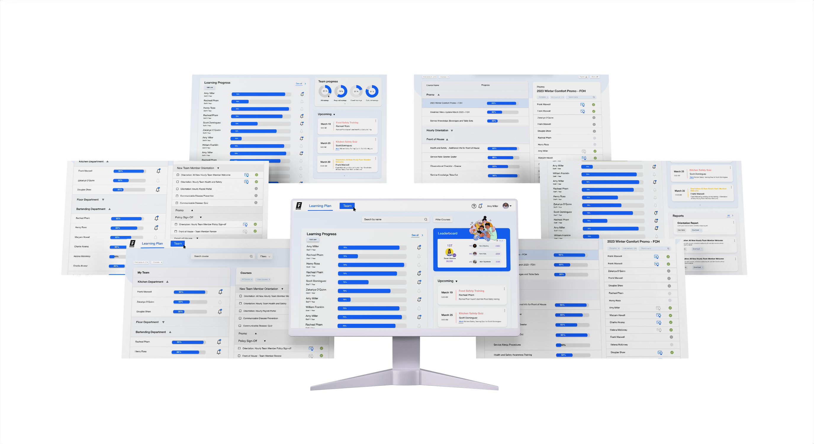
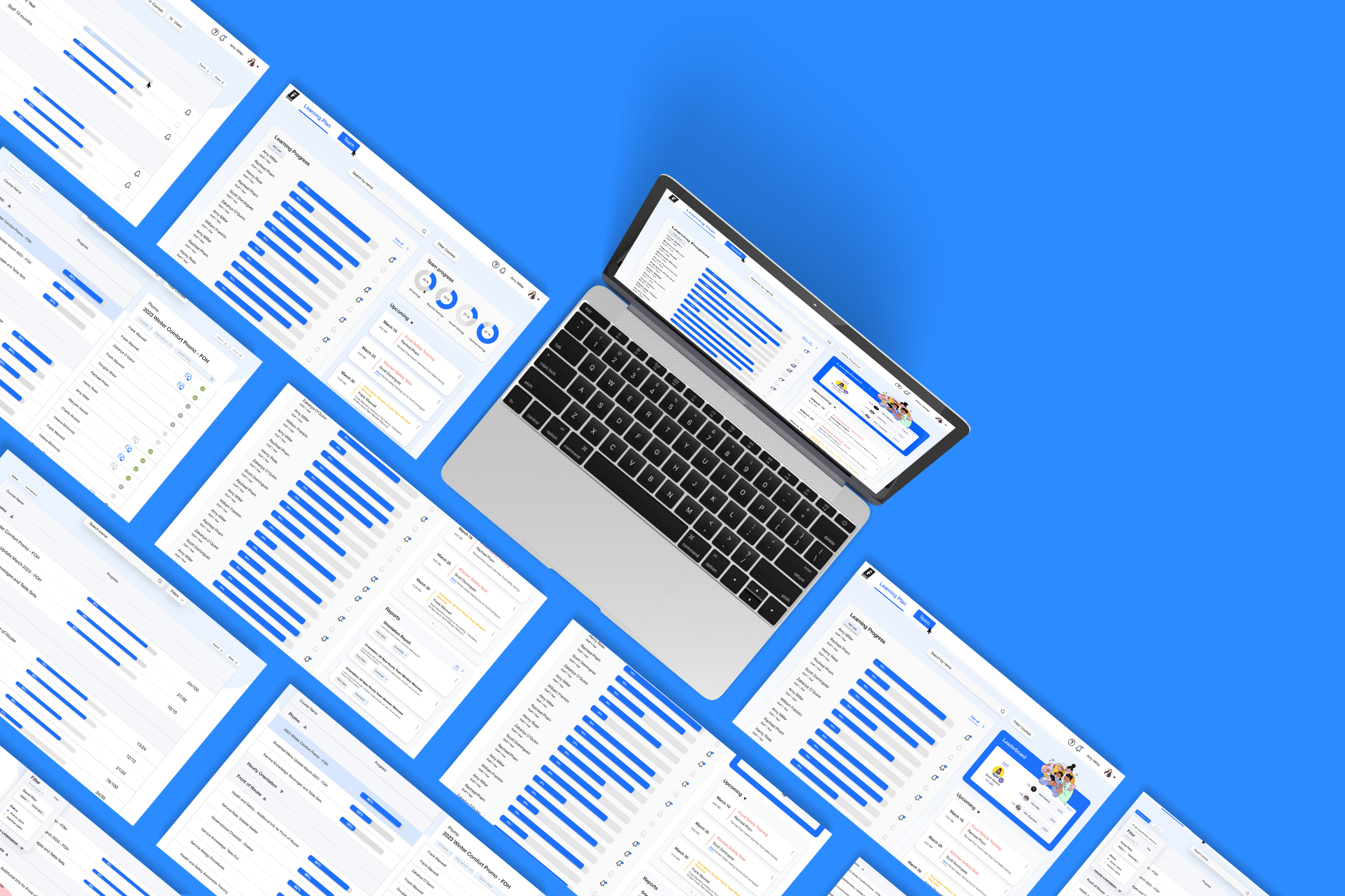
Prototype
Interactive prototypes for user interfaces (UI) are highly detailed and functional representations of a digital product or application that allow users to interact with the interface as if it were a real working system. These prototypes go beyond static images or wireframes by incorporating interactive elements and user flows, enabling users to click buttons, navigate between screens, input data, and experience the UI's behavior and functionality.
- Links together all of the screen and flows in a simulated environment
- Ensures that everything looks good, work well and flows as intended before it goes to production
- This can be considered the pre-code or no-code version of your product
- Links together all of the screen and flows in a simulated environment
- Ensures that everything looks good, work well and flows as intended before it goes to production
- This can be considered the pre-code or no-code version of your product

Surfacing New Issues
The high-fidelity prototype brought test users closest to the real experience , and it revealed some issues. While users were able to complete the onboarding experience, but the platform was not the perfect. Some of the new issues that we have discovered during this stage was the problem of platform loading time, the uncertainty and complexity of the platform.
Lessons Learned
- Collaboration and Communication: Website/platform design often involves working with a team of designers, developers, and other stakeholders. I learned how to collaborate effectively with others, communicate my ideas clearly, and provide feedback to improve the design process.
- Visual Design: Website design requires a good understanding of visual design principles such as color theory, typography, spacing, and layout. I learned how to create a visually appealing application that engages with the users.
- Time management: During this project, I learned the importance of time management. As a full-time student, I had a busy schedule and this project really required me to balance my schoolwork and work on this project. However, I carefully planned my time and paid more attention to prioritization, I was able to successfully manage my time pretty well.
Do not hesitate to contact me to discuss a possible project or learn more about my work.
open to work and collaboration open to work and collaboration open to work and collaboration